Tuesday, May 06, 2014
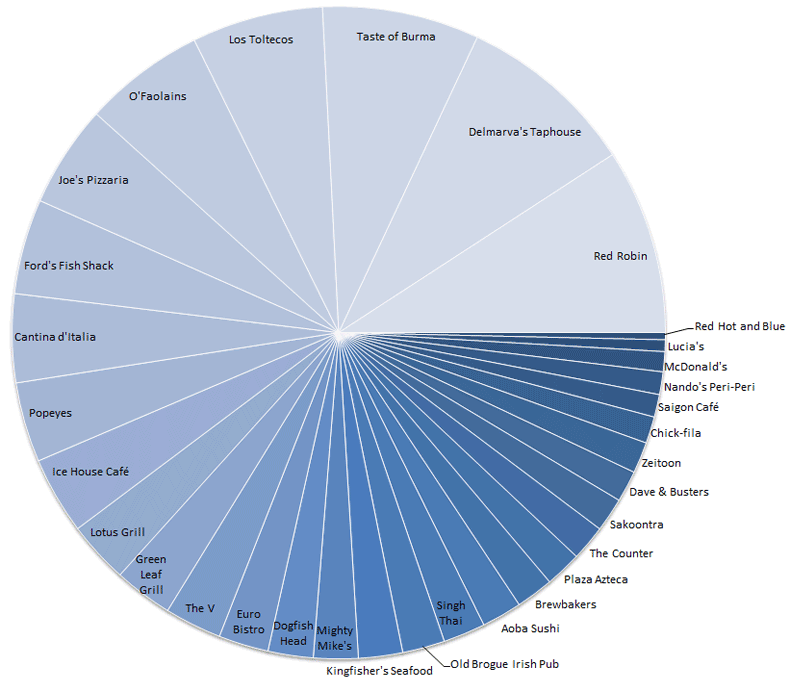
Random Chart Day: Dining Out in 2013
The chart below shows all of the restaurants I ate at and paid for by debit card in 2013. The larger pie slices represent a higher amount spent, not necessarily more visits (Popeyes tops the number of visits chart).

You can also see how this differs from 2012.
|
tagged as
data
|
permalink
| 5 comments
|
|
|
Previous Post: Weekend Wrap-up |
Next Post: Memory Day: Snapshots |
You are currently viewing a single post from the annals of URI! Zone history. The entire URI! Zone is © 1996 - 2024 by Brian Uri!. Please see the About page for further information.
